
Eventually my long running observations, graphs and documents on the issue of the EU will be posted here. I find it rather inconvenient and sinister that we are partaking in scheme which serves no other purpose than to undermine the entire function and reason behind sovereignty. Why?
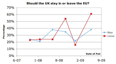
- This graph shows something very interesting, it shows how people's attitude towards leaving the EU has changed over the years. The graph is constantly updated and the data sets used can be found here. As the trend currently stands, the clever British public can spot a quisling when it spits them in the face.


No comments:
Post a Comment